前言
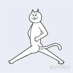
之前围住神经猫的H5小游戏火爆了朋友圈,其中神经猫贱贱的表情,露着屁股的各种姿势,也给用户带来了不少趣味。现在我们就用CSS来撸出一只小贱猫。从网上下载一张我们要仿照的神经猫图片,如下:
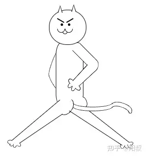
CSS实现的效果图如下:
虽然不能说一模一样,但至少我觉得屁股的弧度已经有了那个精髓吧(还可以再优化优化)
代码实现
头部
头部就是一个不太完全圆的圆形,加上两个三角形耳朵,和面部组成。
<div class=”header”>
<div class=”ear1″></div>
<div class=”ear2″></div>
<!– face –>
</div>
头部通过宽高不同,加上48%的圆角,来打造一个非全圆的头
.header {
position: relative;
width: 75px;
height: 70px;
border-radius: 48%;
border: 1px solid #000;
background-color: #fff;
z-index: 10;
}
耳朵
耳朵是个只有边框的三角形,一般我们实现三角形是通过一个0宽高的元素,只设置一条有颜色的边框,相邻的两条边框设为 transparent 的,这样实现出来的三角形是一个完全填充颜色的三角形。想要实现只有边框,可以在三角形上再叠加一个白色的小三角形,这样看起来就像是一个镂空的只有边框的三角形了。
.ear1 {
position: absolute;
left: 17px;
top: -10px;
width: 0;
height: 0;
border-left: 5px solid transparent;
border-right: 5px solid transparent;
border-bottom: 15px solid #000;
}
.ear1::after {
content: ;
position: absolute;
left: -4px;
top: 2px;
width: 0;
height: 0;
border-left: 4px solid transparent;
border-right: 4px solid transparent;
border-bottom: 14px solid #fff;
}
脸部
脸部的元素就是眼睛、眉毛、嘴巴,先实现元素,再写样式。
<div class=”face”>
<div class=”eyebrow”></div>
<div class=”eye”></div>
<div class=”eyebrow1″></div>
<div class=”eye eye1″></div>
<div class=”mouth”>
<div class=”mouth1″></div>
<div class=”mouth2″></div>
<div class=”mouth3″></div>
</div>
</div>
眼睛、眉毛都是很规则的形状,不用多讲。嘴巴可以分解成3条弧形组成,那么就来画个开口向上的弧形。
.mouth1 {
width: 14px;
height: 7px;
border: 1px solid #000;
border-radius: 0 0 50% 50%/0 0 100% 100%;
border-top: none;
}
设置高度是宽度的一半时,就可以画出一条半圆弧,可以修改高度来改变弧形的大小,再去掉上边框,则实现了开口向上弧形。画出三条弧形进行相对定位拼成嘴巴形状。
身体
身体只是一个普通的长方形,通过 z-index 来设置元素的层级
<div class=”body”></div>
.body {
position: absolute;
left: 14px;
top: 67px;
width: 55px;
height: 130px;
border: 1px solid #000;
border-radius: 20%;
border-bottom-width: 0;
background-color: #fff;
z-index: 5;
}
右手
右手由上臂、下臂、4根手指组成
<div class=”right-hand”>
<div class=”right-hand1″></div>
<div class=”right-hand2″></div>
<div class=”finger1″></div>
<div class=”finger2″></div>
<div class=”finger3″></div>
<div class=”finger4″></div>
</div>
.right-hand1 {
position: absolute;
left: 10px;
top: 0px;
width: 20px;
height: 60px;
border-right: 1px solid #000;
border-left: 1px solid #000;
transform: rotate(-45deg);
background-color: #fff;
border-bottom-right-radius: 10px;
}
.right-hand2 {
position: absolute;
left: 9px;
top: 35px;
width: 18px;
height: 60px;
border-right: 1px solid #000;
border-left: 1px solid #000;
transform: perspective(14px) rotateX(-5deg) rotateZ(45deg);
background-color: #fff;
border-top-right-radius: 10px;
}
.right-hand2::after {
position: absolute;
left: -6px;
top: 0px;
content: ;
width: 15px;
height: 15px;
border-radius: 20px;
background-color: #fff;
}
.finger1 {
position: absolute;
left: -17px;
top: 74px;
width: 8px;
height: 8px;
border: 1px solid #000;
border-radius: 0 0 50% 50%/0 0 100% 100%;
border-top: none;
transform: rotate(140deg);
}
这里同个 border-bottom-right-radius: 10px; 和 border-bottom-right-radius: 10px; 来形成一个圆角,让手肘看起来比较自然一点。 transform: perspective(14px) 进行了微小的变形,让靠近手肘的手臂粗一点,手掌的手臂细一点。手指也是通过对几个弧线旋转定位来组成。
臀部
两片丰满的臀部肉,也一样是通过弧线来实现。
<div class=”buttocks”>
<div class=”buttocks1″></div>
<div class=”buttocks2″></div>
</div>
.buttocks1 {
position: absolute;
top: 196px;
left: 23px;
width: 35px;
height: 12px;
border: 1px solid #000;
border-radius: 0 0 50% 50%/0 0 100% 100%;
border-top: none;
transform: rotate(-56deg);
z-index: 6;
}
.buttocks2 {
position: absolute;
top: 185px;
left: 64px;
width: 20px;
height: 5px;
border: 1px solid #000;
border-radius: 0 0 50% 50%/0 0 100% 100%;
border-top: none;
transform: rotate(-110deg);
z-index: 6;
}
尾巴
尾巴确实有点难搞,无法直接一条弧线就实现,它能上弯下弯的,最后用了5条弧线来实现。
<div class=”tail-wrapper”>
<div class=”tail tail1″></div>
<div class=”tail tail2″></div>
<div class=”tail tail3″></div>
<div class=”tail tail4″></div>
<div class=”tail tail5″></div>
</div>
.tail{
position: absolute;
border: 1px solid #222;
border-radius: 0 0 50% 50%/0 0 100% 100%;
border-top: none;
}
.tail1 {
left: -31px;
top: -11px;
width: 80px;
height: 8px
}
.tail2 {
left: -31px;
top: -3px;
width: 80px;
height: 8px;
}
.tail3 {
left: 50px;
top: -11px;
width: 42px;
height: 9px;
transform: rotate(199deg);
}
.tail4 {
left: 50px;
top: -3px;
width: 36px;
height: 7px;
transform: rotate(199deg);
}
.tail5 {
left: 83px;
top: 3px;
width: 7px;
height: 7px;
transform: rotate(-12deg);
}
腿
最后的腿也是需要大腿粗,小腿细,transform: perspective() 无法实现到类似的效果,因此画两条线条旋转定位就好。
总结
一开始看着这神经猫的图,觉得还是不太好用 CSS 画出来的,花了几个小时,也是搞出来了。不能说能完美实现,但还是相似度较高吧。不禁感叹,CSS 真是万能的!
我建了一个前端小白交流群,私信我,进入交流群。我会给大家分享我收集整理的各种学习资料,组织大家一起做项目练习,帮助大家匹配一位学习伙伴互相监督学习,欢迎加入
作者:linshuai
原文链接:用CSS来撸一只神经猫


